Anatomy of a Typeface Project
The making of:
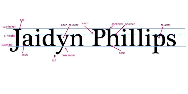
As I learned about typeface and the anatomy of it I was assigned the task of looking at my name and labeling the things I saw. The first thing I did was type my name and put the cap-height bar, x-height bar, and baseline bar in place. Next I started looking for things I could label. Right away I saw the ascender and descender. I also saw the tail, serif, and bowl. From there on I spotted out ore and more things including the bar, open-counter, set, shoulder, and counter.
What was learned:
During this project I learned more about the tools on Adobe Illustrate, the types of text, and the basic anatomy of typography. I did not know that you could label a letter like that, The most interesting part of the project was learning that almost any letter has something that can be labeled and defined.
What could be done better:
If I did the project again I could do better on the spacing of the labels, and the different use of each term. I would explore more with different colors and different fonts.


Comments
Post a Comment